When to use a Defect Pareto Chart?
Last Updated :
09 Jul, 2021
Defects are generally logged and documented. After this, next step is to review and analyze defects with help of different root cause analysis techniques. But before performing root cause analysis, Pareto chart is usually prepared that generally shows type of defect with largest frequency of occurrence of defects i.e. target.
Pareto chart is basically used to determine which of existing problems occurs more frequently. For this, Pareto chart basically represents frequencies of occurrences of different categories of defects or problems being encountered. There are various tasks that need Pareto chart for their process.
When to use Pareto Chart :
- Pareto chart is basically required for analyzing data. This is simply done to determine frequency of problems or main causes in process.
- If there are so many problems that are different from each other or if there are different causes, then Pareto chart is required if one wants to focuses on only particular problem or causes that are more significant.
- By simply focusing on particular components, if one wants to identify major causes, then Pareto chart is required.
- If managers want to identify main problem in workflow process, then Pareto diagram are very useful. Pareto diagrams are commonly known as 80/20 Pareto rule.
- When we want to communicate about our data with others, tell and explain to them about our data, then we can use Pareto chart.
- If one wants to identify major issues or problems regarding business, then pareto charts are required.
Before using Pareto chart, one needs to make sure that whether process data fulfill following points or not :
- Data are compulsorily needed to arranged and sorted into different categories like defects, cost, or count.
- Ranking of categories is essential and therefore should matter because it is very essential for frequency of data. If it is not considered to be important then data frequency will not be relevant. In such cases, it is very much essential to change these categories.
Example :
Let us take an example of customer complaints as shown below :
Diagram – 1 : shows number of customer complaints that were received in five different categories.
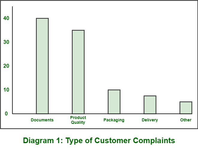
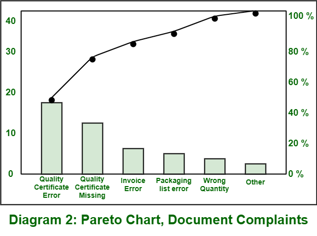
Diagram – 2 : shows highest complaint i.e. documents that are divided into six different categories. These categories are related to complaints regarding documents. It also shows cumulative value at right-hand side.
Like Article
Suggest improvement
Share your thoughts in the comments
Please Login to comment...